

Over the years I’ve had the opportunity to work on all kinds of different projects … the other day someone was talking about Quibi and it reminded me of this one. We did a little commercial that sold the idea of how fun short content on the Quibi platform would be.
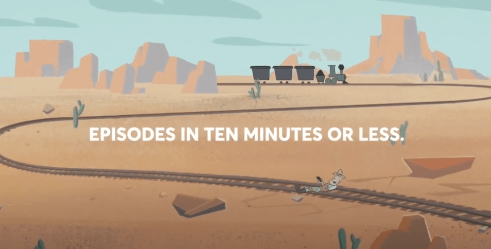
This was late 2019 and we were animating at Titmouse, contracted by the Mill (back when they still had an LA office). The Mill would handle boards / animatic / designs and the agency communication. Titmouse would tackle all the animation, compositing, post editing and exports. Style wise it was supposed to look like Jay Ward animation and directly references Dudley Doo Right and Snidely Whiplash – only instead of the damsel on the railroad tracks, it ends up being our cowboy.
We got to work with one of my favorite animation directors, Mike Carlo, collaborating with the New York Titmouse studio. The compositing and editing were done back at Titmouse Los Angeles. Mike Carlo and I have gotten to do a few projects together over the years and he is incredibly great at problem solving and adjusting while still making the animation look fantastic (and just an all around amazing animator).

We had a tiny budget (there were just 4 of us), a quick schedule and things were changing constantly (as they often do on these things) – characters would change (the cowboy was a different character originally), dialogue changed, composited footage changed, backgrounds changed. Basically over the course of production, everything that could change, did change (often more than once). Nothing would lock until the last second and everything was wet clay up until delivery.
We also had the added challenge of delivering two different versions – landscape (9×16) and vertical (1×1). That meant separate crops, tweaks and exports – you’re doing everything twice on the back side. That was a new idea at the time that Quibi was trying to capitalize on – content that worked full screen no matter how you held the phone (vertical or horizontal).
Related side note – Back around 2003-2004 when we switched to “HD” from 4×3, we had a somewhat similar problem – formatting to keep action inside tv safe on the 4×3, while trying to populate the edges of the screen. So they ended up exporting two versions – one for people still watching on old traditional 4×3 tv’s and a widescreen version for people on what were then known as “HD” tv’s. If you watch shows from this era, you might see lots of dead space onscreen on the sides, and this is why.
End of the day, we got it done, our compositor cursing at us all the way with our last minute changes from the client. Looking back on it now, it’s maybe a little simple, but for the limited time and money (and all the changes we had), it turned out pretty great. I vaguely remember seeing this run during some tv network sports games, so it got out into the wild and saw some distribution.
One of the things I learned on this commercial (and continue to learn on small projects) is practicing flexibility. Doing things out of order and changing content constantly during production can drive you crazy – your job is to slow down, think through it, and adapt. This one was small enough that it never got out of control and I could learn HOW to adjust on the fly. We had great collaborators at the Mill who were there with us through it all. Finally, if you have a great partner to help you in your quest (like Mike Carlo was for me on this one) you can get through the craziest situations and come out with great work.
Parting thought – Funny that Quibi as a concept / company didn’t do well, but here we are all constantly watching IG / Youtube / Tiktok / etc shortform content 6 years later and everyone’s attention spans have likewise eroded. People make fun of the execution of Quibi, but it may have just been too far ahead of the curve with not enough runway – clearly the idea works on some level.
Here’s the commercial!
